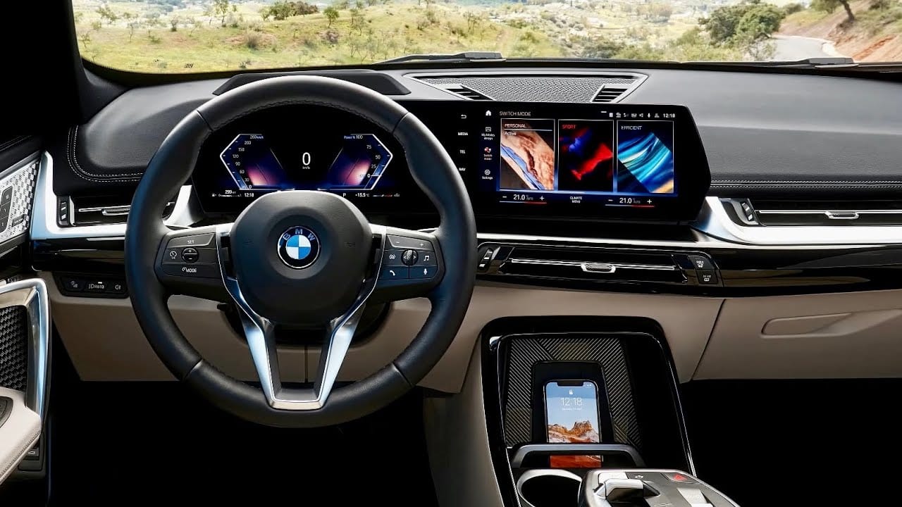
For Road & Track: Who Killed All The Buttons In Cars?
BMW, Tesla, backup cameras—who’s the real culprit? I set out to solve a murder mystery.

The rain came down relentlessly as I piled into the Polestar 2. I was soaked through like a stray dog tossed into a frozen pond and every bit as mad; the parking ticket shoved under the wiper blade didn’t do much to assuage my mood. The streets of New York City are never kind to anyone, especially not in February.
I reached for the familiar touch of hard plastic switches to crank the heater and warm my seats. I found none, only a big touchscreen with menus to fish through instead. That didn’t help my disposition, either.
I knew this had been happening for years, the death of buttons in cars. I saw it get worse and worse the longer I spent in this business. Used to be, this was what you got on the futuristic electric vehicles, like this Polestar. But now it was everywhere. That new Chevy Colorado makes you go through a screen menu to turn on the headlights. The 2023 BMW X1 got rid of a ton of buttons too, making you use the screen if you need to cool off a bit. Hell, even that little iDrive controller knob is going away soon. The Mercedes EQS’ optional dashboard is basically just one huge screen. I knew they would all be like that eventually.
When, I wondered, did it all get so bad?
[Read the rest at Road & Track]

